Your client sees your name, even on a small review plan.
A client opens your review link before they read a single comment. Branding is on every paid RME plan, including Basic - your logo, colors, and subdomain. No climbing a feature gate to look professional.

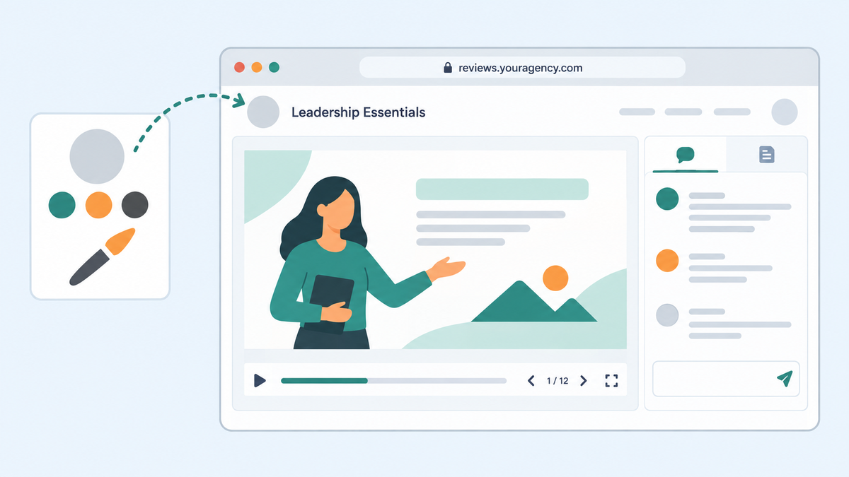
A client opens a course review link. Before they read a single comment, they see the space they have been asked to use. Does it look like an extension of the agency they hired, or a tool nobody explained?
Branding will not fix a poor review process. It can, however, make the handoff feel intentional. When several client teams are reviewing courses at once, a recognizable logo and review space also help people know they landed in the right place.
Do not reserve the client-facing experience for your biggest account
Review My eLearning includes branding and a custom portfolio on every paid plan, including Basic. The controls are the ones you would expect: your logo, your colors, a custom subdomain, and a portfolio page for your best work. Every plan includes the same feature set; plans differ only in the number of courses and uploaders - not in whether you are allowed to look like yourself in front of a client. A small agency can set up its client-facing review identity without choosing a higher plan just to unlock branding.
This is a packaging point, not a claim that RME invented branded review. zipBoard's public pricing shows a Team plan starting at $99 per month, and its own FAQ notes that features like a custom domain sit in the Enterprise plan. The platforms may define "branding" differently, so compare the specific controls your team needs, not just the label in a pricing table.
A useful client handoff
- Set up the identity the client should recognize before sending a review link.
- Open the link as an outside reviewer, not as the signed-in account owner. Check the actual first screen, logo, and link.
- Explain where comments go, who can see them, and when the team will close the cycle. A branded screen does not answer those questions by itself.
- Keep the same review space across versions so the conversation does not scatter into email.
A small team should pay for the capacity it uses, not a feature gate it has to climb over to look professional. That is the comparison worth making.
Set up your review space before you send the next link. Start a free trial - no credit card required.