Smashing your eLearning By Improving Fonts

Fonts… Either you have them or you don’t.
When is comes to reviewing courses on RME, it quickly becomes apparent when a developer doesn’t have the correct fonts installed.
You can see that the formatting is off, that the font, well, it just looks… ugly… At that point you make your first comment as you review the course: Did you install the right fonts?
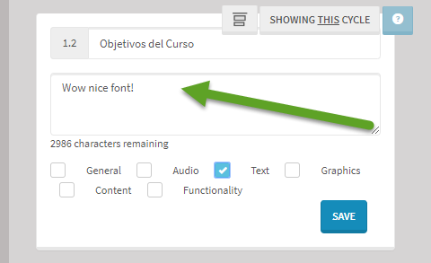
Unfortunately for developers, what you see isn’t always what you get before you publish a course, which is what makes Review MyElearning so helpful for everyone involved in the development cycle.
You may have, at some point, inherited an old Source file, or perhaps been asked to make some “minor” revisions…
Only to realize that the fonts used are not free, you don’t have them installed, or you thought you installed them a year ago but your authoring tool cannot “see” them. Ugh… and this my friend, circles back to the question: Which fonts are best for creating Smashing eLearning?
The answer is (beyond all of the great research already done on fonts- aka typeface) is to ask yourself a few questions before beginning the cycle of abuse and pain for those having anything to do with your course in the future… and consider asking a few questions (actually these questions can start in the Analysis phase or perhaps in the Evaluation phase, but for the sake of this moment, lets start with Development) such as: Who will be developing and uploading these courses to RME? Not only now, but in the future? Who will have access to your Fonts? Do you have a budget to purchase fonts for the team? Which devices will learners be using to take your courses with? Are they web friendly? Will your company and/or client have access to these fonts? These are important questions to ask because… it is not only practical, but it is KIND to keep dev folks sane in the future. We are all in this together, right?! That is the heart of Smashing elearning!
We have all seen some super cool eLearning and sometimes seeing new fonts is so freshing… like having a 4 shot iced-carmel frapuccino from Starbucks after doing social distancing for 6 weeks… and for sure take some time searching for them (see link below for inspiration!) however, it’s important to remind yourself, there are some classic, web-friendly fonts that look beautiful… In fact, I had the pleasure of reviewing a sharp, clean, crisp course recently (I wish I could say I dressed like that course), and I felt pretty lame when I asked what font was used- only to find out it was Helvetica! I can’t remember the last time I used Helvetica in a course. Geez! It looked fantastic the way the developer applied it in the course!
In contrast, let’s say you are developing a new theme and want need a little wowza for your team working on building 25 courses.. then absolutely, why not take the time to look into some new fonts….there are some rad and free ones out there! Check out https://elearningbrothers.com/blog/5-awesome-google-fonts-other-typography-treats/ as just one example of many! But again, it’s important to consider who is going to do the development not only now, but in the future. Be kind, choose the best font and pay it forward!
Speaking of additional karma points, don’t forget to create a Font folder in your shared drive for the developers of the near distant future. They hate asking as much as you would with the hope that you actually still have them (if you even can share them).
Keep being fearless and fun! Don’t tolerate ugly fonts; maybe they were used back in the day was because of a branding guideline or because that is the font the company has always used so you don’t want to rock the boat… but go ahead, use ReviewMyElearning to share your new look and feel with your client, your team and your boss! They may bow down to you for creating a fresh look, and its such a great feeling to see “I love the font” in your comment field in RME!


